Part 3:
Collagraphs:
The first thing I love about collagraphs is that there is so much you can do to create an image. I’ve done several workshops and experimented with a variety of media to create texture and patterning, but there is always something new to explore and every tutor has tips and tricks to pass on.
In this workshop Gabriella provided thin mountboard as a base to work from. The idea was to build onto this, seal the board and print from it. Ink could be either pushed into the lower areas and wiped away from the relief sections or vice-versa.
Here are a few of her samples:
 In the top two photos you can see her original collagraph plates, shellacked and mounted into her visual diary. The one on the left is mountboard with sand adhered, the right hand picture shows a mountboard base with torn cardboard shapes adhered to the surface. The different effects she has achieved with the two is a direct result of the way she has inked and rubbed back.
The bottom photo shows some prints from another collagraph plate on different papers. The white paper shows a stark, crisp image whereas the yellow/cream paper manages to dull the black and reduce some of the detail.
I’ve not had any success using sand before so this was my opportunity. I decided to go with low relief, hoping I would be able to create different effects by choosing to either ink or not ink the recessed sections.
 Above left: mountboard base with applied sand, textured paper, masking tape and scratching onto the plate surface. Right: after shellac was applied.
Some of the other collagraph plates created by my classmates:
 Clockwise from top left: 1) Sand, textured paper and a pearl beaded trim. Frankly I balked at this going through the press with this very high relief trim included. It’s unclear what the pearls were made of, could have been plastic, but there was the potential for a damaged roller and blankets or shattered pearls. Not good. 2) Very high relief with thick coffee grounds. This plate resulted in an undefined speckling across the paper with some flooded areas where the ink pooled in amongst the coffee. 3) Hessian, scrim and thick string. 4) A mix of fabrics, trims and plant material. The leaves weren’t flat, wouldn’t stick to the mountboard and so moved when printing. They also didn’t hold the ink properly despite the shellac surface (which would have been a nightmare to coat properly).
This was the final part of the course and was rushed, as is clear from the attempts at understanding the instructions regarding building and printing a collagraph. Most of the results were poor (at best), some were appalling and no-one seemed to understand the process. It had been explained quite well but with the majority being new to printmaking there wasn’t a lot of chance that things would work out well for most in this section of the course. Hard to go through an entirely new process, create plates, print and get good outcomes in less than 2 hours with 12+ students where only one of them had done it before (and that was me!).
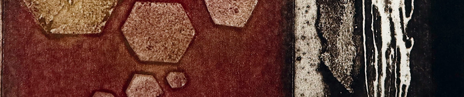
 My collagraph print continues my tree theme (detailed in previous posts) and is based on some of my photos of tree bark and other tree striations. I’ve rotated my imagery 90° and combined several ideas to form this lovely variation in density and pattern.
The plate was first printed in red and ochre. That print was discarded and black was lightly applied over the still-dirty plate, picking up the remains of the original colours. So just a touch of them come through breaking up the harshness of the black.
This is a terrific start to a new project and I shall continue to print this sampler trying out other effects and colours. Once done, I shall create a bigger, more complex, version perhaps with some chine collé included.
